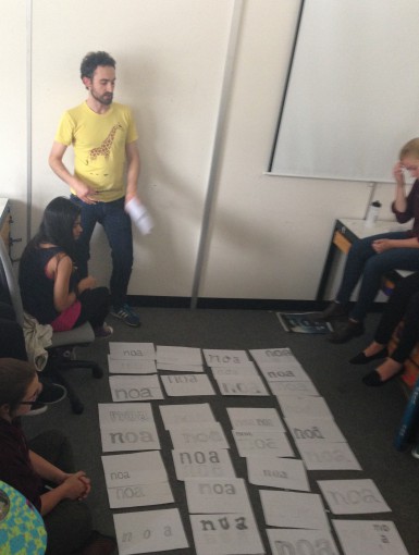
In one of our lectures of Authorship and Interaction we had the honor to host Dave Crossland,a graphic and interaction designer, who is consulting for the Google Web Fonts project in England, commissioning new typefaces designed for the web, and offering lectures on typeface design with free software.
After a presentation about the use of free software, Dave talked about the four principle of design which are:
-Alignment
-Contrast
-Proportion
-Repetition
and asked everyone to create our own font with the letters a,n,o.
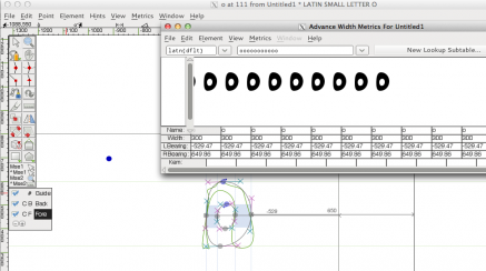
After sketching them in A4 white sheets and giving us advice for a correct design he encouraged us to try Fontforge, a free application which allows the creation of new typefaces.
In order though to achieve this,as Fontforge was an unknown programme for most of the students, he showed us some basic tools and information we ought to know and therefore gave us the opportunity to experiment.
Personally i found it really hard to create something like that from zero and without having an actual idea of the exact type of font you would like to create.The following two are the n and o I created through Fontforge:
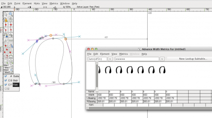


FontForge